Lara Schenck
Lover of programming, maker of monsters
Category: Design
-

Notes from Clarity Conf 2018
Clarity Conference was back at the beginning of December last year, but better late than never, right? I took handwritten notes on my iPad and have (finally) transcribed them for your scanning pleasure.
-
Design Systems Checklist
The design systems conversation is officially under way at PMC which is extremely exciting and something I need to write more about. But in the mean time, I want to share the Design Systems Checklist by Tim Schoch. There are so many design systems-related things floating around my brain at any given moment, and this…
-

Dead Fish ≠ Code Export
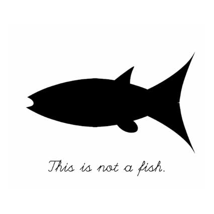
This post is a response to a tweet critiquing the “code export” capability of design tools, and a talk called “Stop Drawing Dead Fish” that calls for better tools to allow artists to create visual art without code. Should designers code? Should artists code? It’s a nuanced, interesting topic and I had some thoughts.
-
Another poster for Q2L
-
Poster design
Kinda fun! For a mission teaching high school students about genetics.
-
2013 Web Design Shout Outs
The past few weeks I have been entirely overwhelmed with inspiration and need to drop some serious shout outs: People and Places First and foremost, the the entire web design/dev/tech community. What an open, motivating, and supportive group of people! In particular: Brad Frost – whose work makes me so excited to build things. Matt…
-
Cargo Cult CSS
About every other day I read a blog post about a new take on CSS best practices. I think either “I’m doing right!” or, “Ohh that makes sense, I’ll change my ways”. Cargo Cult CSS is another of these posts, and resulted in an “Ahh…now I’m really confused, but this was an excellent read.”
-
Hippo illustration
I needed to make an anthropomorphic/mentor-like figure for a project and did some experimenting with a hippo. Pretty cute, if I do say so myself.
-
DML Conference 2013
In a couple of weeks (March 14-16) I’ll be heading to Chicago for the annual Digital Media and Learning Conference organized by the DML Research Hub. The theme this year is “Democratic Futures: Mobilizing Voices, and Remixing Youth Participation”. There has been a longstanding narrative of youth political apathy and disengagement from democratic life. As…
-
The F & Z Layouts in Web Design
On the F layout: The F-Layout relies upon various eyetracking studies for it’s foundational concept. These scientific studies show that web surfers read the screen in an “F” pattern – seeing the top, upper left corner and left sides of the screen most… only occasionally taking glances towards the right side of the screen. These…
-
The Good Man – CSS3 animation
Fantastic audio/visual artwork, created by Pedro Ivo Hudson. via Awwwards
-
An Interactive Guide to Blog Typography
via Sidebar (A daily email digest of the best 5 design links. Highly recommended.)
-
Pittsburgh Web Design Day 2012
Just got back from Web Design Day, hosted by Refresh Pittsburgh, Pgh’s web design meetup group. After a day of excellent presentations by some excellent speakers, excellent drinks and snacks were had at Commonwealth Press for the after party. #WDD2012 win, I’m definitely looking forward to next year. Thanks to Val and Jason Head for…
-
made myself a logo
The font is Geometric Slab 712 BT. Nabbed that from the school computers. There is a free alternative called Arvo that I’m using for some of the heading styles on here.