This post has been marinating in my drafts for a few weeks, and I’d like to get it out into the world before I learn a whole bunch through talks and conversations at WordCamp US this weekend and refine my views accordingly.
Note that I’m assuming a base level of knowledge about what Gutenberg is and its ensuing drama – if you need to catch up, check out this post, this post, and this post, then come back here!
I’m really excited about Gutenberg
As new website projects arise, I keep thinking “Gutenberg would be perfect for this!!”.
I see Gutenberg as the shining solution to an ecosystem of options-laden themes and plugins that have turned WordPress into a frustrating experience for both site creators and site visitors in terms of usability and performance. The WordPress editor hasn’t changed significantly since 2003; it’s still the same big ol’ blob of content.

In most of the sites I build, I replace the editor with a system of blocks powered by Advanced Custom Fields. If there’s anything I’ve learned from my years of developing websites, it’s that content blocks are the answer. Gutenberg shows that WordPress (and many other CMSs) have come to the same conclusion!

Is Gutenberg a new editor, or a new WordPress?
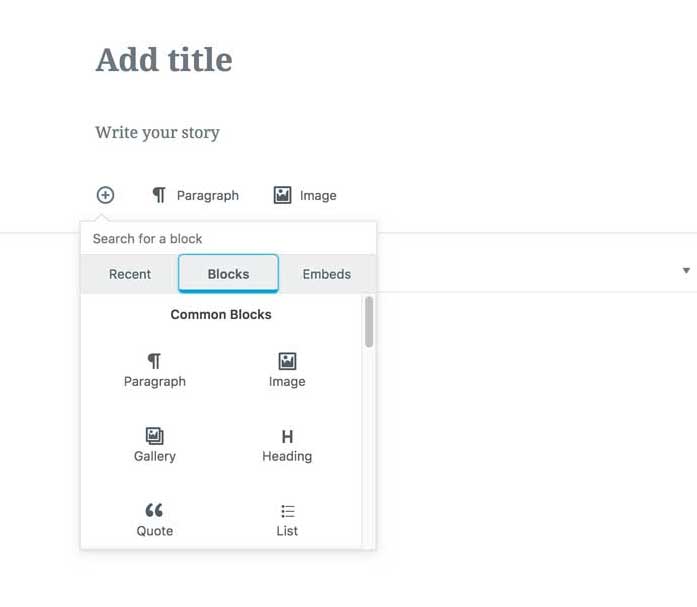
My initial impression of Gutenberg was that it is essentially a page builder built into core, a native solution for both my ACF blocks and the likes of Divvy, Beaver Builder, and Visual Composer. Based on its full-page-editing, Medium-esque UI, however, it presumes to take over the entire post editor, shutting out all other parts of the editing experience, leaving meta boxes and customization of the post editor an afterthought, something for others to figure out.
This is where Gutenberg has been quite contended. With this takeover-the-page UI, it transforms the default post editor from a canvas for themes and plugins into an editing experience with little apparent room or need for customizations.
Isn’t the beauty of the WordPress ecosystem its extensibility, its independent themes and plugins, many of which have morphed into booming businesses? What will happen to them when their product has been tucked into an accordion or loaded within an iframe, when previously it could exist front and center? Why would WordPress alienate this huge user base and economy for the sake of essentially replicating Medium?
I’m on the fence
The part of me that builds custom-fields driven WordPress sites for decent money feels this way:
Gutenberg should be the new content editor, not a full-page experience that takes over the post editing screen concealing all other elements. It should not attempt to replace the architecture of meta-box driven themes and plugins but should be a tool to be used within them. It should be a page builder built into core, and would do well to be tested as a plugin first.
Then there’s the part of me who sees how horrible the overall usability is of themes and plugins, and how incredibly difficult it is for a new WordPress end-user to navigate creating a modern-looking brochure website. That me, thinks:
Burn it down! The system is broken! WordPress SUCKS! Themes SUCK! Blocks are the answer!!! Make everyone use them for everything!!!!!
Stay Tuned
I am interested to see if and how these viewpoints reconcile themselves during WordCamp US. Stay tuned for a follow-up post, likely titled “Thoughts on Gutenberg (Post WordCamp US)”, or “Burn it down!!!!!” (kidding).
