I must write this while it is fresh in my brain! I just did some pair programming with the other front-end developer working on Cantaloupe (which is the code-name for a large project at work, more here). Yahil Madakiya from rtCamp and I needed to figure out a CSS Grid solution for some tricky responsive layout.
Here were the designs for this element, what we call a “Roadblock” at PMC – i.e. something that is interjected within a feed of stories:

This is a perfect example of a nuance that is “no big deal” in design software, but becomes a bigger deal in translation to the web…and then back to “no big deal” because we now have CSS Grid!!!
The issue here: the large heading text and the CTA (the “See all” button) do not have consistent treatment with regards to how DOM elements flow. Yahil initially coded the markup like this, working from a mobile first approach and envisioning the top two elements in their own row:
<section>
    <div>
        <h3>Fall 2018 Premiere Dates</h3>
        <a>See All</a>
    </div>

    <p>See all the New and Returning Series</p>
</section>
Getting either of those approaches to adjust to the other screen layout doesn’t really work – in that layout, the heading and the descriptive text would be in the same element, and aligned vertically with the button on the right.
Alternatively, if someone was working from the desktop design first, they might have included the h3 and the p in the same element. Then you’d need to do some wonky absolute positioning to get the button to sit next to the heading on small screens.
So, when we started working on it together I thought….CSS algorithm time!!! Let’s pseudo-code some boxes! We were screen-sharing, so I used Adobe Illustrator instead of paper – though I much prefer paper for pseudo-coding boxes.
Here is what we came up with:

With CSS Grid, we end up flattening our markup and relying less on actual element containers to structure the grid – now that is CSS’s job, not HTML. In the above image, the black boxes represent the DOM elements and the orange boxes represent the explicitly defined Grid cells. Our markup is now flattened and looks more like this:
<section>
	<h3>Fall 2018 Premiere Dates</h3>
	<p>See all the New and Returning Series</p>
	<a>See All</a>
</section>
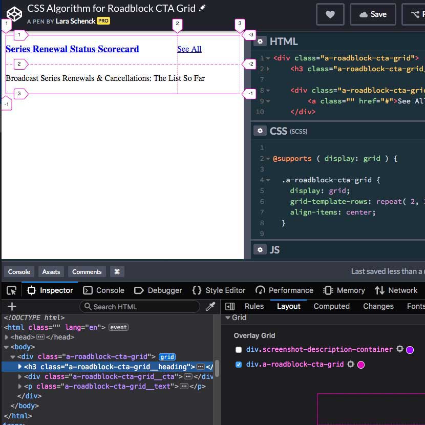
Next, we set up a front-end workshop in CodePen and went back and forth for about 10 minutes, figuring out the right declarations to accomplish our goal. We used the Firefox Grid tool to fine tune our solution:

As we were working – there was something I couldn’t get after a few tries, and my inner critic was like, “Sheesh, Lara, this is kind of extreme to take so much time and put so much process into this one tiny thing…it’s just CSS…and you don’t even know Grid well enough to get it apparently…”
But then, Yahil said, “Do you think something like this would work?” and he sent a link to this Grid by Example from Rachel Andrew indicating the use of the span keyword.
Just what was missing! If I had given up right then, you wouldn’t be reading this blog post because it wouldn’t exist.
I had been trying to use grid-column: 1 / -1; to get the “Text” box to span both columns. Yes, indeed span 2 was the missing ingredient. Hooray for pair programming!
Now that we had the algorithm working and determined complete in our walk-through (Step 3 from this blog post about Writing CSS Algorithms), it was time for Step 4, Optimize! In this case, we did the following to optimize the algorithm:
- Removed all of the other utility classes and applied more intentional names for the selectors. The algorithm is called
a-roadblock-cta-grid. It’s a long name, but better to be long and descriptive than short and vague! - Added an
@supportsaround the Grid code and tested the non-grid display by adjustingdisplay: gridtodisplay: grad, a value that does not exist. It looked fine! - (Still to-do) Integrate the algorithm into the code-base and update the breakpoint with our breakpoint mixin.
- (Still to-do) Add the selectors to the pattern’s markup so that the algorithm is fully integrated into the code-base.
Here is our final CodePen:
See the Pen CSS Algorithm for Roadblock CTA Grid by Lara Schenck (@laras126) on CodePen.
Okay, that’s all for now! Hopefully that helps give another tangible example of what I mean by “CSS algorithm”. Perhaps the true defining qualities of CSS algorithm vs. not CSS algorithm are 1) solving a specific problem and 2) keeping the solution to that problem separate from the rest of your CSS so that it can be used elsewhere…and is therefore testable!! Still not sure how this will work, but I will dig into that eventually.
